A logo can look right on a screen and still look off on a shirt. Fabric is softer than paper, thread has a physical width, and your customers read a staff shirt from six feet away, not twelve inches. The typeface does most of the work.
The best fonts for business t shirts are bold sans serifs such as Impact, Bebas Neue and Montserrat Black. Clean standards like Helvetica, Futura and Georgia work too. Pick a heavy weight, keep letters open and avoid hairline strokes. Script and playful fonts suit a headline or casual brand if the strokes stay thick.
Below are 30 business logo fonts sorted by mood. You also get pairing advice, mistakes we see on garments and common questions. We stitch our designs rather than print them, so some tips come from watching letters behave in thread.
How to Choose the Best Font for a Business T-Shirt
This section is for anyone staring at a font menu with a deadline. Work through it in order and you will narrow 30 options to two or three in a few minutes.
- Write the exact words that will go on the shirt. A four-letter name and a twelve-word slogan need different typefaces.
- Decide who reads it and from how far. Uniforms and event crews need distance readability. A café tee can afford more personality.
- Choose a mood: bold, standard or playful. Each of the three lists below follows one mood.
- Test the font at the smallest size it will appear, such as a left-chest logo. If a letter blurs at that size, move to a heavier weight.
- Check it against your shirt colour. Light thread on a dark shirt reads best in thick strokes. A thread colour close to the fabric colour makes any font hard to read.
Serif, Sans Serif, Script: What Each Says About a Business
Read this part if you are not sure which family fits your brand. It takes one minute.
Serif letters have small feet at the ends of strokes. They look established and a little formal, which suits law offices, bakeries and consultants.
Sans serif letters have no feet. They look direct and modern, so tech, trades and fitness brands lean on them. Script fonts imitate handwriting and add warmth, but they get hard to read past two or three words.
9 Bold Fonts for Business T-Shirts
Bold fonts suit crews, contractors, gyms and any shirt that has to be read while someone is moving. These nine hold up at distance.
- Impact is the heavy condensed face most people already have installed. It fits long company names into a narrow chest area.
- Anton behaves like a lighter Impact with slightly more breathing room between letters.
- Bebas Neue is all capitals and tall. A one-word brand looks confident in it, but a full sentence turns shouty.
- Oswald comes in several weights, so one family covers a headline and a subline.
- League Gothic is narrower still, handy when a business name has more than 18 letters.
- Montserrat Black is wide and geometric, a safe pick for modern service companies.
- Archivo Black has a stocky, slightly retro build that suits garages, breweries and builders.
- Barlow Condensed works well in the bold weights for team rosters and department names.
- Alfa Slab One is a chunky slab serif with real presence, which makes it popular for farms and hardware stores.
10 Standard Fonts for Business T-Shirts
Standard fonts are for brands that want to look settled, such as offices, clinics, schools and professional services. Most of these are old, tested and readable at small sizes.
- Helvetica is the default of corporate branding, neutral to the point of invisible.
- Arial is its close cousin and is installed everywhere, which matters when a colleague needs to edit the file.
- Futura has near-perfect circles and a clean geometric feel that suits design studios.
- Gill Sans has a humanist warmth, a good match for bookshops and cafés.
- Garamond is elegant at small sizes, though you need a bolder cut for fabric.
- Georgia was drawn for screens, so its letters are sturdy and open.
- Baskerville reads as trustworthy and a bit academic, which suits accountants.
- Playfair Display has dramatic thick and thin strokes. Use the bold weight, because the hairlines vanish otherwise.
- Lato is friendly without being childish, a quiet choice for healthcare and retail.
- Open Sans is plain and very legible, built for long names and small print.

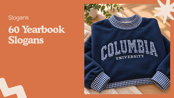
A single serif word in white thread on black is about as simple as a business shirt gets. Our Simple Something Embroidered Shirt shows how much a restrained font can carry without a logo beside it.
8 Playful Fonts for Business T-Shirts
Playful fonts belong on shirts for events, outings, kids' brands and relaxed workplaces. Use them for a headline, then pair with something calmer for the rest.
- Pacifico is a rounded brush script that feels like a beach shack menu.
- Lobster is a bold script with a retro diner feel and holds its shape at modest sizes.
- Fredoka has soft rounded corners and suits anything aimed at families.
- Baloo 2 is bubbly and legible, and works for bakeries and play spaces.
- Chewy is cartoonish and loud. A pet groomer can pull it off, a law firm cannot.
- Permanent Marker looks scrawled by hand, made for a pop-up or a weekend market stall.
- Caveat is a casual handwriting face that reads like a signature on a note.
- Amatic SC is tall, thin and hand-lettered. It is lovely on screen but needs a bold setting, since the thin strokes struggle on fabric.
3 More Business Logo Fonts for Tricky Cases
This short list covers three cases the first 27 handle badly. Those are a very long name, a very short one and a premium brand.
- Roboto Condensed fits long names, such as "Riverside Heating and Air", on a single line.
- Poppins Bold gives a three-letter brand a round, friendly weight.
- Cormorant Garamond Bold brings a boutique feel, though it needs a large size to stitch cleanly.
Great Business Fonts by Type of Business
If a list of 30 feels like too much, start with your industry. These are starting points, not rules.
Trades and Construction
Heavy condensed sans fonts such as Impact, Oswald or Anton read fast on a jobsite and survive a lot of washing.
Food, Coffee and Bakeries
Gill Sans, Alfa Slab One or Lobster give a menu-board look. Keep the script for the name only.
Offices and Professional Services
Helvetica, Georgia and Baskerville keep a staff polo quiet and credible.
Fitness, Events and Creative Studios
Bebas Neue, Montserrat Black and Futura signal energy without a lot of decoration.
How to Pair Fonts on a Business Shirt
Use this when one font is not enough, for example a name plus a tagline. Two fonts give you hierarchy, three start to look messy.
Pair a loud font with a quiet one. Bebas Neue for the name and Lato for the tagline is a reliable combination. Lobster as a headline sits well above Open Sans.
Two fonts that are nearly alike look like a mistake rather than a choice, so skip pairs such as Helvetica and Arial.
Font Mistakes That Show Up on Real Shirts
These come up often enough to be worth a read before you place an order.
Hairline strokes disappear. A stroke in thread has to hold a row of stitches. Fine serifs and thin scripts blur or fill in. That is why we recommend the bold cut of any elegant font.
Tiny text fails first. A slogan under the logo may look fine in a mockup and turn into a smudge at chest size. Cut the words or enlarge the line.
Low contrast loses readers. Grey thread on a navy shirt looks refined in a photo and reads as nothing from a few steps away.
All caps for a whole sentence is tiring. Keep capitals for names and single words.
Finally, check spelling twice. Personalized items cannot be returned, so a typo in the file stays on the garment.
Why Embroidery Changes Which Font Works
This section is for owners deciding between printed and stitched shirts. A print can reproduce almost any font at any size. Thread cannot, which is why font choice matters more for stitched work.
We only do embroidery. A stabilizer layer sits behind each design so the lettering lies flat. New patterns are test-run on scrap fabric to adjust stitch density.
A detailed design takes roughly 4 to 9 minutes on the machine. The thread is French DMC, which does not fade or bleed. Everything is made to order and arrives in 3 to 7 business days. Unworn, unwashed items can be returned within 30 days, except personalized pieces.
If you want to see how names look in thread, browse the personalized embroidered gifts. A custom name striped tote bag or a custom logo embroidered apron makes a practical piece of staff or client merch. Still comparing typefaces? Our guides to fonts for t shirts and fonts for business cards cover other uses.
FAQ About Business T-Shirt Fonts
What is the best font for a business logo on a t-shirt?
A heavy sans serif such as Montserrat Black, Oswald or Helvetica Bold is the safest choice. Thick strokes and open letters stay readable on fabric and at a distance.
Can I use more than one font on a business shirt?
Yes, two is the practical limit. Pair a bold headline font with a plain, quiet one for the tagline.
Are script fonts a good choice for business logo fonts?
They work for short names and casual brands. Pick a thick script such as Pacifico or Lobster, and avoid thin ones for stitched work.
What font size is readable on a left-chest logo?
Keep the text large enough that no stroke is thinner than a line of stitching. Test your design at the real size before you order, and shorten the wording if it crowds.
Do great business fonts need a licence?
Some do. Many Google Fonts, including Oswald, Lato and Open Sans, are open source, while others such as Helvetica and Futura are commercial. Check the licence before you use a font in a logo.