From the top row of the bleachers, nobody reads a jersey. They read a shape. A fat, square 23 registers before the player's face does, and a thin, fancy 23 turns into a gray smudge. That is the whole test a jersey font has to pass.
The best fonts for sports jerseys are heavy block and collegiate faces for numbers and condensed sans serifs for long last names. Baseball teams add one script for the chest. Good sports fonts keep thick strokes, open counters and clear differences between 1 and 7. Print your pick at full size and check it from across a room before you order anything.
We are an embroidery shop, and we don't make jerseys. We do stitch letters on sweatshirts and hats every day, so the notes on thin strokes and small text below come from that work. The 24 fonts are grouped by style, then sorted by sport.
Athletic jersey fonts in block and collegiate styles
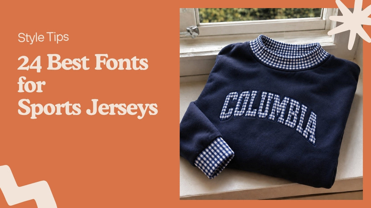
Pick from this group if your team wants the look people picture when they hear "jersey": arched names and square numbers. These are some of the best athletic fonts for youth leagues, school teams and alumni games.
1. Freshman
Freshman is a free varsity font you can download from most font sites. Its letters have the notched corners of a letterman patch. Read the license file that comes with the download, because free for personal use and free for shirts you sell are different things.
2. Graduate
Graduate sits in the Google Fonts library, so a coach, a parent and a printer can all open the same file at no cost. The serifs are short and square. Arch it over a chest and it looks like a college sweatshirt from the 1970s.
3. Princetown
Want the old letter-jacket feel without drawing anything? Princetown has squared serifs and a stiff, upright build. Set the team name in it and use a plainer block for the numbers.
4. Octin Sports
Typodermic made Octin Sports with cut-in notches that copy sewn felt numbers. The numerals carry the style. If your club only changes one thing this season, change the numbers to this.
Condensed sans serif fonts for sports jerseys
Teams with long surnames should start here. A condensed font fits "Abernathy-Kowalski" across the shoulders without shrinking it to a size nobody can read from the field.
5. Bebas Neue
All caps, tall and narrow. Bebas Neue is free on Google Fonts, so any volunteer can install it in a minute. That matters when three parents are each making part of the roster file and the names need to match.
6. Oswald
Oswald comes in several weights, which Bebas Neue's free version does not. Use the bold for the back name and a lighter weight for a sleeve or a warm-up shirt, and the set still matches.
7. Anton
Anton is heavier than Oswald and tighter between letters. On a white jersey with navy lettering it reads from far away. On a small youth size the letters can crowd, so add a little tracking.
8. Teko
Teko has squared-off curves. The 0 and the 8 look boxy, almost like a scoreboard, which suits volleyball and esports teams that want something less traditional.
9. Big Shoulders Display
Big Shoulders was drawn for the City of Chicago's design system. The name comes from Carl Sandburg's poem "Chicago." It has a lot of widths. The narrow ones handle long names, the wide ones make strong numbers.
10. Staatliches
Staatliches is a single-weight display face with flat tops and bottoms. It has a slightly European, poster-like look. Soccer clubs and run clubs tend to like it more than football teams do.
11. Impact
Impact ships with Windows, so it costs nothing and opens anywhere. The downside is that everyone recognizes it. Fine for a one-day tournament shirt, a little flat for a uniform you will keep for five seasons.
12. Agency FB
Microsoft Office installs Agency FB, and its squared, narrow letters look technical. Good for a robotics club or a lacrosse team that wants a modern number. The thin weight is too light for a jersey back, so stick to bold.
13. Industry
Fort Foundry's Industry is a paid font with a mechanical, squared feel and a long list of weights. Its numbers look like they belong on a scoreboard. Budget for the license if a printer or embroiderer will produce shirts for sale with it.
14. Champion Gothic
Hoefler&Co named the widths of Champion Gothic after boxing weight classes, from Bantamweight to Heavyweight. Pick a narrow width for names and a heavier one for numbers. Same family, two jobs.
Slab serif fonts with a vintage look
Throwback nights, alumni games and dad-league softball teams get the most out of slab serifs. The thick, square serifs survive on fabric better than thin ones.
15. Clarendon
Clarendon dates to 1845 in England, and its bracketed slab serifs still show up on retro baseball and football designs. It works best for a team name. Its numbers are a bit soft for the back of a jersey.
16. Rockwell
Rockwell came out of Monotype in 1934, with geometric shapes and flat slab serifs. The bold weight makes a clean, square number, and Microsoft Office has bundled Rockwell for years.
17. Alfa Slab One
A free Google Fonts slab with very heavy strokes and small counters. Use it at large sizes only. Below that, the holes in a, e and 8 fill in, especially in thread.
Squared and cool athletic fonts for modern kits
These cool athletic fonts suit esports teams, hockey clubs and anyone who finds varsity letters too old-school. Most have hard corners and very few curves.
18. Eurostile
Aldo Novarese designed Eurostile in 1962, and its rounded-square letters still look like motorsport graphics. The extended widths make wide, short numbers. Pair it with a condensed font for names so the back does not run edge to edge.
19. Russo One
Russo One is free and heavy, with angled cuts on some corners. The letters stay readable at small sizes. That makes it a practical pick for sleeve numbers and shorts.
20. Black Ops One
This one is a stencil, with gaps cut through each letter. Paintball and airsoft teams love it. On an embroidered patch, those gaps can close up, so give it plenty of size.
21. Saira Stencil One
Saira Stencil One is a lighter, cleaner stencil than Black Ops One. It suits a running club or a cycling team kit where the name is the design. For numbers, the regular Saira family is safer.
22. Racing Sans One
Racing Sans One leans forward like a speed stripe. Use it for a short team name on the chest, never for numbers. Slanted 1s and 7s confuse referees.
Script fonts for baseball and softball jerseys
Baseball and softball are the sports where a script chest wordmark looks normal. Keep the script for the team name and use block numbers everywhere else.
23. Yellowtail
Yellowtail is a free script with a 1950s ballpark look and a natural place to add a tail swash under the word. Short team names like "Rays" or "Sox" look best. Ten letters or more and it starts to tangle.
24. Kaushan Script
Kaushan Script looks brush-painted, rougher than Yellowtail. A beer-league or coed softball team gets more personality from it. Skip it for anything that needs to read in under a second.
Fonts for jersey names and numbers
This part is for whoever builds the roster file. Uniform fonts usually split into two jobs, and one font rarely does both well.
Numbers need weight. The best numbers are block, collegiate or heavy condensed: Octin Sports, Freshman, Anton, Champion Gothic in a heavy width. Check 1 and 7, 6 and 8, and 3 and 8 side by side.
Names need width control. A condensed sans like Oswald or Bebas Neue keeps a long surname the same height as a short one. Arch the names only if the font still reads when it bends; script and stencil fonts usually don't.
Most leagues have their own rules on number size and color contrast. Ask your league office before you order, not after the shirts arrive.
Matching the font to the sport
Use this section if your team plays one sport and wants to look like it. These are habits, not rules.
Basketball jersey fonts
Basketball jerseys have no sleeves and a narrow chest, so fonts for a basketball jersey need to work in a tight space. Collegiate block for the chest name, a tall condensed number like Anton or Big Shoulders on the back.
Baseball and softball
Script across the chest, block numbers on the back and sleeve. Yellowtail plus Freshman is a safe pair.
Football
Football numbers are big and get read by officials in motion. Square block numbers with an outline in a second color are the norm. Avoid condensed widths for numbers here.
Soccer
Soccer kits lean on clean sans serifs. Staatliches, Oswald and Teko all fit, and they look right next to a club crest.
Hockey and esports
Squared fonts like Eurostile and Russo One feel at home on both. Hockey sweaters have room on the sleeves for numbers, so test the font at sleeve size too.
Rec leagues and fonts for sports teams with a joke name
Office softball teams and pub trivia squads can break every rule above. A slab or script font with a silly team name works, as long as the numbers stay plain. Our team shirt ideas for work, clubs and group trips has more on naming the team.
How to pick a font for a jersey in 6 steps
Follow these steps if you are the parent, coach or captain who got stuck with the design job.
- Write down the longest name on the roster and the two hardest numbers to tell apart (usually 1 and 7, or 6 and 8).
- Type that name and those numbers in three or four fonts from the lists above.
- Print each one at the real size it will be on the shirt, not shrunk to fit a page.
- Tape the printouts to a wall and walk 30 feet away. Cross out any you have to squint at.
- Check the license for each survivor. Free on a font site does not always mean free for shirts you sell.
- Send the font file to whoever is printing or stitching. Ask for a proof before the full order.
What changes when the lettering is stitched
Read this if any part of the jersey, warm-up or fan gear will be embroidered instead of printed. Thread is not ink, and some fonts that print well stitch badly.
Thin strokes are the first problem. A hairline serif becomes a single wobbly line of thread. Heavy block and condensed fonts have strokes wide enough for proper satin stitches, so the letters look solid.
Small closed shapes are the second. The inside of an a, e or 8 can fill in with thread. That is why we stitch every new design on scrap fabric first and adjust the stitch density before it goes on a garment. We also put a stabilizer behind each design so the fabric doesn't pucker around the letters.
Thread color counts as much as the font. Navy thread on a black hoodie disappears even in a perfect font. If you want to know how the stitch file gets made, read what digitizing in embroidery means and how stitch count affects the price. For hand stitching names at home, our guide on how to embroider letters covers the basics.
Printed numbers crack and peel after many washes, while stitched or sewn-on letters sit inside the fabric. We compared the two in embroidery vs screen printing, and the care steps are in how to wash embroidered clothing.
Font licenses for team shirts you sell
This section matters for boosters, clubs and anyone selling fan shirts to raise money. A font license controls where you can use a font.
Fourteen fonts on this list come from Google Fonts, which releases them under open licenses that allow commercial use. The first seven are Graduate, Bebas Neue, Oswald, Anton, Teko, Big Shoulders Display and Staatliches. The other seven are Alfa Slab One, Russo One, Black Ops One, Saira Stencil One, Racing Sans One, Yellowtail and Kaushan Script.
Fonts from free download sites vary file by file, so open the readme. Paid fonts like Industry, Champion Gothic and Eurostile need a desktop license for whoever makes the design.
Pro and college team fonts are a separate case. Many are custom-made for the team and trademarked. Copying one for your own league is a bad idea, even if a lookalike file is floating around online.
Embroidered lettering from our shop
This is for fans and families who want stitched letters on something other than a jersey. We make sweatshirts, hats and totes to order, with thread colors you can pick on many designs.
Name and school pieces are in our personalized embroidered gifts. The designs people buy most often are in best sellers. Each piece is stitched with French DMC thread, made in 1-3 business days and delivered in 3-7 business days in total within the US.
FAQ
What is the best font for a jersey number?
A heavy block or collegiate font such as Octin Sports, Freshman or a heavy width of Champion Gothic. These keep 1 and 7, and 6 and 8, easy to tell apart from a distance.
What fonts work for jersey names?
Condensed sans serif fonts like Oswald, Bebas Neue and Anton fit long surnames across the shoulders without shrinking them. Avoid scripts and stencils for names that need to be read quickly.
What font do basketball jerseys use?
Most basketball jerseys pair a collegiate block name on the chest with a tall condensed number on the back. Anton, Big Shoulders Display and Freshman are free fonts that give that look.
Are there free athletic fonts for sports teams?
Yes. Graduate, Bebas Neue, Oswald, Anton, Teko, Big Shoulders Display and Russo One are all on Google Fonts under licenses that allow commercial use.
Can any font be embroidered on a jersey?
Most heavy fonts can, but fonts with hairline strokes or tiny serifs lose detail in thread. Ask for a stitched sample or a proof before ordering a full team set.
Can I use an NFL or NBA team font on my jersey?
Usually not. Many pro team fonts are custom designs owned by the team or league, so pick a public font with a similar style instead.