
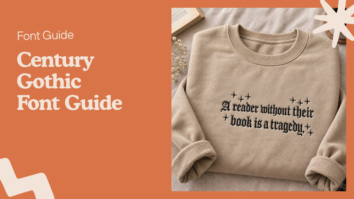
The name sounds like something carved over a cathedral door. Century Gothic is the opposite: round letters, open spaces, almost no contrast between thick and thin strokes. That mismatch trips people up all the time, and it is a good place to start.
Century Gothic is a geometric sans serif typeface that Monotype released in the early 1990s. It is built from near-perfect circles and straight lines, and it ships with Microsoft Office. People pick it for headings, logos and posters, where a clean, friendly look matters more than reading comfort.
We work with lettering every day, though ours is stitched rather than printed. So this guide covers the usual history and letter shapes. Then it adds the part most font write-ups skip: how a font like this behaves on a sweatshirt or a hat.
Where Century Gothic came from
This section is for anyone who wants to know why the font looks so much like a 1970s magazine cover.
Monotype based Century Gothic on its own older face, Twentieth Century, which Sol Hess drew in the late 1930s and 1940s. The new version was cut to match the letter widths of ITC Avant Garde Gothic, the 1970 design by Herb Lubalin and Tom Carnase. Matching widths meant a document set in Avant Garde could switch to Century Gothic without the line breaks moving.
Distribution did the rest. Because it came bundled with Microsoft software, millions of people had it installed without ever buying a font. That is why you see it on school flyers, office slide decks and small-business signs.
How to recognize Century Gothic
Use this when you see a sign or logo and want to name the font before you go hunting for it.
Letter shapes to check first
- The lowercase a is a single bowl with a stem, like a handwritten a, not the two-story a you see in most body fonts.
- The lowercase g is also single-story, a circle with a hook below.
- Capital O and C are close to perfect circles, which makes words look wide.
- The x-height is tall, so lowercase letters sit high against the capitals.
- Strokes keep nearly the same weight all the way around each curve.
Century Gothic vs Futura and Avant Garde
Futura, drawn by Paul Renner in the 1920s, has a smaller x-height and sharp, pointed capitals like A, M and N. Avant Garde is the closest relative. Its proportions match Century Gothic closely, and the display version adds tight ligatures that make headlines look packed together. If the letters feel roomy and round with short ascenders, Century Gothic is the better guess.
Why a clean sans serif is called "gothic"
This part is for shoppers and designers confused by search results that mix round modern fonts with medieval script.
In 19th-century American type foundries, "gothic" was a label for letters without serifs. Franklin Gothic and News Gothic carry the same naming habit. Century Gothic follows that tradition.
In fashion and tattoo circles, "gothic font" means something else entirely: blackletter, the heavy, angular script also called Old English. That is the style on our Witchy embroidered sweatshirt, where the stitched letters have sharp points and hooked tails.

So if you searched for a gothic font to put on a shirt and landed on Century Gothic, you probably wanted blackletter. If you wanted a clean, round look, you are in the right place.
Free fonts similar to Century Gothic
This section helps if you design on a machine without Microsoft Office, or you want a font you can use on products you sell.
Century Gothic is a commercial font licensed by Monotype. Having it on your computer through Office does not cover every use. Embedding it in an app or selling goods with it may need more. Read the license that came with your copy, or buy one, before you put it on merchandise.
A few open-source fonts on Google Fonts get close in feel:
- Questrial, a light geometric sans with round bowls that suits short headings.
- Didact Gothic, with simple, open forms and a single-story a.
- URW Gothic, an open-source font modeled on the Avant Garde shapes.
None of these is an exact copy. Set a test word with an a, g, O and e in each and compare it side by side with your sample.
Century Gothic on embroidered clothing
Read this before you send a design in Century Gothic to any embroidery shop, ours included.
Thin strokes and small sizes
Screen fonts can be as fine as a pixel. Thread cannot.
The light weight of Century Gothic has strokes so thin that a machine has trouble filling them. At small sizes, the round openings in letters like e and a tend to close up. Bold weights stitch far more cleanly.
Fabric matters too. Heavyweight fleece, like the cotton and fleece blend in our sweatshirts, has more texture than paper, and thin lines can sink into it. We put a stabilizer layer behind every design so the stitches lie flat. New designs get a test run on scrap fabric to adjust stitch density before anything goes on a garment.
Thread color and contrast
Low-contrast fonts depend on color to stay readable. Black thread on sand fleece reads from across a room. Gray on heather gray does not. Many of our designs let you choose the garment color and the thread color, and that choice affects legibility more than people expect.
Blackletter goes the other way. Its heavy strokes hold up well in thread. That is part of why so many stitched quote designs use it, like our book lover sweatshirt with blackletter text.

How to choose a font for embroidered text
These steps work for a name on a stocking, a short quote on a hat or a full line across a sweatshirt.
- Decide the size first. A name across a chest gives you room for thin fonts, a cap front gives you much less.
- Pick a bold or regular weight over a light one. Hairline strokes are the first thing to disappear in thread.
- Print the word at real size on paper and hold it at arm's length. If you squint and lose the letters, so will everyone else.
- Choose thread that contrasts with the fabric by at least a few shades.
- For personalized pieces, check the spelling twice. Personalized items cannot be returned, so a typo stays a typo.
Our personalized embroidered gifts go through the same checks, and each order is stitched to order, then made and shipped within 3-7 business days.
Where Century Gothic works best and where it struggles
Use this as a quick gut check before you commit the font to a project.
It shines in headings, logos with one or two words, slide titles and posters. The wide letters give a calm, modern feel, and they look friendly next to photos.
Long paragraphs are another story. The single-story a and round shapes slow reading over many lines, and the wide letters eat horizontal space. A report set fully in Century Gothic will run longer than the same text in a narrower face.
On clothing, it suits short words in a heavier weight. For a moody, dramatic look, blackletter fits better, such as the stitched lettering on our A Little Ray of Pitch Black floral hat.

Want to see how other lettering styles look in thread? Browse our best-selling embroidered designs.
Century Gothic FAQ
Is "Centry Gothic" the same font as Century Gothic?
Yes. "Centry Gothic" is a common misspelling, and the font people mean is Century Gothic, the geometric sans serif from Monotype.
Is Century Gothic a gothic font?
Not in the blackletter sense. The word "gothic" in its name is an old American type term for sans serif letters.
Is Century Gothic free to use?
It comes with Microsoft Office, but it is a licensed Monotype font. Check your license before using it on products you sell or in an app.
What Google font is closest to Century Gothic?
Questrial and Didact Gothic are close in feel, and URW Gothic is an open-source font based on Avant Garde shapes. None is an exact match.
Is Century Gothic good for a logo?
It works well for short wordmarks that need a round, modern look. Pick the bold weight if the logo will be printed small or stitched.
Can Century Gothic be embroidered?
Yes, in bold or regular weight at a size large enough for thread. The light weight and very small text tend to blur because the strokes are thinner than the stitches.


