What Is the Lithos Font
This section is for anyone who saw a carved, ancient-looking headline and wants to know what typeface it was. The Lithos font is an all-caps display typeface with a stone-cut look, built on letters from old Greek inscriptions.
In short, Lithos works best as a headline or short label at a large size. It stops working when you set it small or in long paragraphs. Keep it to a few words and it looks confident. Push it into body copy and it gets tiring fast.
Where the Lithos Font Came From
Use this section if you want the background before you pick it for a project. Carol Twombly designed Lithos for Adobe in 1989. The name comes from the Greek word for stone, which tells you what she was after.
The letterforms follow the look of capitals chiseled into marble and rock. Strokes flare slightly at the ends, the way a chisel leaves them. The shapes feel a little uneven in a way that reads as hand-cut rather than drawn by a machine.
Lithos has no true lowercase. Type a lowercase letter and you get a smaller capital, so a line of text always reads as inscription.
How to Recognize the Lithos Font
Check these traits when you are trying to identify a font on a poster, a logo or a shirt.
- Every letter is a capital, with no tall and short letters mixed together.
- Strokes are thin and even, with a slight flare at the tips and no real serifs.
- The E, F and L are narrow, while the O and C are wide and nearly round.
- The feel is classical and a bit rough, like lettering on a monument.
If a font has these traits but a different R or S, it may be a lookalike. Several stone-style fonts borrow the same idea.
When the Lithos Font Works and When It Does Not
Pick Lithos when the message is short and should feel old, solid or ceremonial. Skip it when people need to read a lot.
- Good for titles, event names, restaurant signs, book covers and team or club names.
- Good for two to five word statements on apparel, where the carved shape gives the words weight.
- Weak for small captions, because the thin strokes lose detail.
- Weak for sentences and paragraphs, because all-caps text slows reading.
Fonts That Pair Well With Lithos
Because Lithos is loud and capital-only, the partner font should stay quiet. Choose one pairing and stop.
- A classic serif such as Garamond for body text, which echoes the old-world feel.
- A plain sans serif such as Helvetica or Arial for captions and small details.
- A simple script only when you need a single soft accent word, used once.
Avoid putting Lithos next to another decorative display font. Two fonts competing for attention make the design look confused.
How to Choose a Font for Embroidery in 5 Steps
These steps are for anyone planning custom lettering on a sweatshirt, cap or tote, whether the font is Lithos or something else.
- Write the exact words first. Short phrases stitch better than long ones.
- Pick the size on the garment. Lettering smaller than about a quarter inch tends to fill in with thread and lose its shape.
- Look at the thinnest strokes in the font. Hairline strokes can disappear once they become thread, so a sturdier weight is safer.
- Choose a thread color that contrasts with the fabric. Letters that sit close to the garment color are hard to read.
- Ask for a test or a preview before you commit, especially for names, which cannot be returned once personalized.
Mistakes to Avoid With Stone-Style Lettering
This is useful before you place an order or send artwork to a stitcher.
- Using a thin cut of the font at small size, which turns delicate strokes into blobs.
- Setting a long sentence in all caps, which is tiring to read on a shirt front.
- Adding wide letter spacing to every line without checking how it looks on the finished piece.
- Forgetting that the carved look needs plain space around it, so crowding the design with icons hurts it.
How We Stitch Bold Lettering at Me Do Embroidery
We stitch every piece to order with French DMC thread that does not fade or bleed. A stabilizer behind the design keeps the lines flat so the fabric does not pucker. Each new design is test-run on scrap fabric first so we can adjust stitch density before it goes on a garment. A detailed design usually takes about 4 to 9 minutes on the machine.
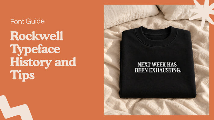
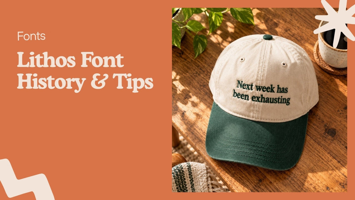
If you like short, strong wording on clothing, look at the Next Week Has Been Exhausting embroidered sweatshirt or the matching embroidered baseball hat. They are good examples of how a single line of text can carry a whole piece.

For names and custom wording, browse our personalized embroidered gifts. Personalized items cannot be returned, so check spelling before you order. Production takes 1 to 3 business days and the full order usually arrives in 3 to 7 business days.
Lithos Font FAQ
Who designed the Lithos font?
Carol Twombly designed it for Adobe in 1989, based on Greek capitals carved in stone.
Is the Lithos font free?
No. Lithos is a commercial Adobe font. Check its license before using it on products you sell.
Does the Lithos font have lowercase letters?
No. Lowercase keys produce smaller capitals, so all text appears in capitals.
What fonts are similar to Lithos?
Other stone-inspired capital fonts with flared strokes are close in feel, though most differ in the letters R, S and G.
Can the Lithos font be embroidered?
Yes, if the letters are large enough and the weight is not too thin. Thin strokes at small sizes lose detail, so use a sturdier cut and keep the text short.