You are picking letters for a sweatshirt, a cap or a poster. One typeface keeps standing out because it looks tall, narrow and very heavy. That is usually Onyx. People search for the Onyx font to name it, learn where it came from and decide if it suits their project.
The Onyx font is a condensed, high-contrast display typeface with very thick vertical strokes and hairline thin ones. It works best at large sizes for titles, logos and short bold lines, and it gets hard to read when set small.
What is the Onyx font
This section is for anyone who has seen the font and wants a quick definition. Onyx belongs to the fat face family: letters drawn with extreme thick-to-thin contrast, a style that began in 19th century advertising. Think of it as a narrow cousin of Bodoni with the heavy strokes pushed further.
Two features give it away. The letters are condensed, so a long word fits in a small width. They are also high-waisted: the crossbar of letters like E and H sits above the middle. Together they give it a formal, slightly theatrical look.
Onyx typeface history and designer
Read this if you need to credit the typeface or want the background for a design brief. Microsoft's typography page lists Gerry Powell as the designer and says Onyx began at American Type Founders in 1937. The page adds that its look was inspired by a typeface called Stephanie, issued by the Bauer foundry in 1870. The version most people have on their computers comes from Monotype.
Be careful with dates. Some font write-ups give a different year for Onyx. If the date matters for something you will publish, check the Monotype listing instead of copying a number from a blog.
The font also ships inside Microsoft Office as a cloud font. That is why it turns up on so many flyers. It is a single style with no bold or italic, so you cannot make it heavier or lighter.
What the Onyx font looks like
- Thick vertical stems next to hairline connecting strokes.
- Tall, condensed capitals with a high crossbar.
- Tight spacing that makes words look like solid blocks.
- No weight options, so contrast is built in.
The hairlines are the part to watch. On a bright screen they look crisp. On a phone, a small print or a stitched logo they can almost vanish, and the word turns into a row of thick bars.
Best uses for the Onyx font
Use Onyx when the text is short and large, and when you want it to look formal or dramatic.
- Headlines and posters: three or four words at a big size read well and look confident.
- Event titles and invitations: a name or date line gets a vintage, printed-bill feel.
- Logos and wordmarks: short names such as a cafe or a band suit it. Long names do not.
- Merch: one bold line across a chest or cap front can look sharp if it is wide enough for the hairlines to survive.
Skip it for body copy, captions, menus with small descriptions and anything people read on a phone at arm's length.
How to use the Onyx font in 5 steps
These steps suit a headline on a poster, a social graphic or a shirt mockup.
- Keep the text short. Under five words is the safe range.
- Set it big. If the hairlines disappear when you zoom out to the size of a phone screen, make it larger or choose another font.
- Use capitals or title case, and leave the spacing alone. The built-in tight spacing is part of the look.
- Pair it with a plain companion font for everything else, so Onyx is the only loud thing on the page.
- Print or preview a test at real size before you commit.
Onyx font in embroidery
This part is for anyone planning to turn a font into thread. Thread has a limit that ink does not: a stitched line cannot be thinner than the thread itself. Hairline strokes get thickened by the digitizer or they break up. A font with extreme contrast like Onyx loses its main feature on fabric.
At Me Do Embroidery we only embroider. Every new design is test-stitched on scrap fabric first, which is how thin strokes and tight gaps get caught. We stitch with French DMC thread over a stabilizer so the letters lie flat. A detailed design usually runs 4 to 9 minutes on the machine.
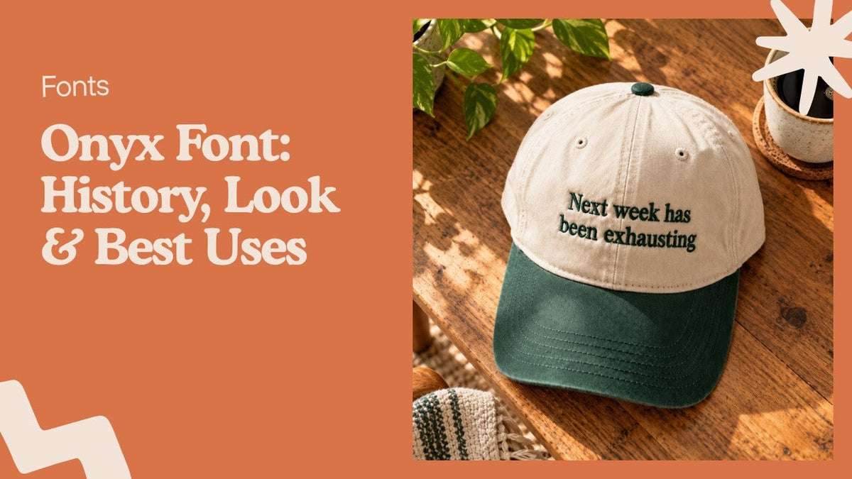
If you like the look of contrast serif lettering in thread, the Next Week Has Been Exhausting embroidered baseball hat is a fair example. It is not set in Onyx, but its letters have clear thick and thin strokes and they stay readable at cap size.

For names and short custom lines, browse the personalized embroidered gifts, or look at the custom name embroidered apron. Personalized items cannot be returned, so check the spelling before you order.
Fonts that pair with Onyx
Pick a quiet partner. A simple sans serif such as Arial or Helvetica gives the eye somewhere to rest. A neutral serif like Times New Roman also works for a classic look. Avoid pairing Onyx with another display font, since two loud fonts compete.
If you are still choosing for apparel, our list of fonts for t shirts that read well in print and thread covers more options.
Mistakes to avoid with the Onyx typeface
- Setting a paragraph in it. Readers give up after a line or two.
- Using it at 12 to 14 point on a flyer. The hairlines drop out.
- Adding a thin outline or drop shadow, which fights the contrast already there.
- Choosing a thread or ink color close to the background. Low color contrast plus low stroke contrast is unreadable.
- Assuming it is free for commercial use. Check the license that came with your copy before you sell anything.
Onyx font FAQ
What is the Onyx font?
It is a condensed, high-contrast display typeface in the fat face tradition, designed by Gerry Powell and now distributed by Monotype.
Is it Onyx or Onxy font?
The correct spelling is Onyx. "Onxy font" is a common typo, and people searching it are looking for the same typeface.
Is the Onyx typeface free?
It comes with Microsoft Office, but that does not automatically cover commercial printing or resale. Read the license for your copy.
What fonts look like Onyx?
Bodoni Poster Compressed and other condensed fat face or Didone display fonts have a similar look. Compare samples at your final size before choosing.
Is Onyx good for body text?
No. The hairline strokes and tight spacing make it tiring to read in anything longer than a short line.
Can Onyx be embroidered?
It can be stitched, but the thin strokes usually need to be thickened, so the result looks heavier than the original font. Test a sample first.