A font can look sharp on a screen and still turn into a smudge once a needle runs through it. Thread has width, fabric pushes back, and tiny gaps close up. Picking the right typeface matters more than most people expect.
The best font for embroidery has thick, even strokes, open counters and letters that are not squeezed together. Bold sans serifs, sturdy serifs and simple block letters stitch cleanly at almost any size. Thin hairlines and tiny decorative details are the usual troublemakers. Below are 40 fonts sorted by how they behave in thread, plus a few rules for hats, sweatshirts and totes.
What makes the best font for embroidery
This section is for anyone who wants the rules before the list. Check these four things and you can judge almost any typeface yourself.
- Stroke width: aim for strokes that are at least 1 mm thick once stitched. Thinner lines sink into the fabric.
- Letter height: 0.25 inch (about 6 mm) is a practical floor for lowercase. Capitals can go a little smaller.
- Counters: the holes inside a, e, g and 8 should stay open. Tight counters fill with thread.
- Spacing: a touch of extra letter spacing keeps neighboring letters from merging.
Popular embroidery fonts: clean sans serifs
Pick these when you want a plain, readable result on a sweatshirt, tote or polo. They also work as a basic fonts list for anyone starting out.
Basic fonts list for first-time orders
- Helvetica: Even strokes and a neutral look. If you cannot decide, start here.
- Arial: Close to Helvetica, available on every computer, and easy to match with a design mockup.
- Futura: Geometric round letters suit a short name or a single word on a chest.
- Gill Sans: A slightly warmer sans with varied widths. Good for two-word phrases.
- Franklin Gothic: Heavy and compact, so it holds up on thick fleece.
- Century Gothic: Wide, round and airy. Great for a short line, less so for a long sentence.
- Verdana: Built for small screens, which means roomy spacing that helps small thread letters too.
- Tahoma: A tighter cousin of Verdana. Fits more text across a pocket.
- Montserrat: Modern and wide, a safe pick for slogans in capitals.
- Roboto: Slightly squared curves that digitize without surprises.
Serif fonts that stitch well
Serifs bring a classic, formal look to monograms, family names and anniversary gifts.
- Times New Roman Bold: Familiar, tidy and fine at medium sizes. Skip the regular weight.
- Georgia: Sturdier than Times with larger letter shapes. A good fit for names on towels.
- Garamond Bold: Elegant, but only above about 0.4 inch tall.
- Baskerville: Sharp contrast between thick and thin strokes. Use it big or not at all.
- Bodoni Bold: Fashion-magazine drama. The hairlines need an enlarged size to survive.
- Playfair Display Bold: A modern take on high-contrast serifs that reads well in capitals.
- Rockwell: Slab serifs have almost no thin parts, so the thread never gets lost.
- Clarendon: Western-poster energy with thick, forgiving strokes.
Script fonts for names and signatures
Script suits personalized pieces like a stocking, a hoop or a wedding gift. Connected letters have to be thick enough to survive the needle, so lean toward bold scripts.
- Brush Script: Casual and recognizable. It needs a minimum height of about 0.5 inch.
- Lobster: A heavy, friendly script that holds its loops.
- Pacifico: Rounded and cheerful, a natural for kids' names.
- Dancing Script: Lighter and livelier. Bump the size up one notch.
- Edwardian Script: Formal and thin. Save it for large, slow-stitched wedding monograms.
- Snell Roundhand: Calligraphy feel for a first name on a gift. Test it before you commit.
Block and varsity fonts
These are the picks for team names, initials and anything that should shout from across a room. Thick strokes make them forgiving for beginners.
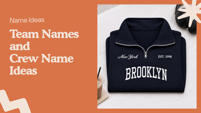
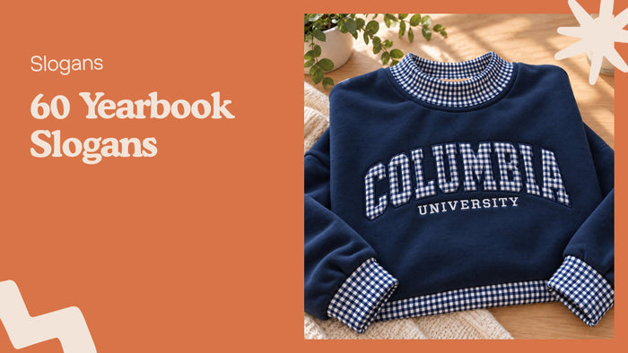
- Varsity block: The classic collegiate letter. Works in one color or with an outline.
- Bebas Neue: Tall, narrow capitals that fit long words on a narrow strap.
- Impact: Meme-era heavy type, and it stitches as boldly as it looks.
- Oswald: A condensed face that squeezes a long phrase into a short space.
- DIN: Road-sign lettering. Practical for numbers and dates.
- Stencil: Built-in breaks mean fewer thread jumps and a rugged look.
Cool embroidery fonts with personality
For a funny line or a statement piece, these give the words some attitude. Keep the text short. Decorative letters tire the eye fast. A long sentence in Old English becomes a wall nobody reads.
- Old English: Blackletter that says tattoo shop or gothic gift. Use capitals sparingly.
- Cooper Black: Soft, fat letters with a retro 1970s feel.
- Comic Sans: Hated online, but its open shapes sew nicely, and it makes a joke land.
- Bangers: Comic-book lettering for exclamations and one-word punchlines.
- Courier: A typewriter look. Pick the bold version so the thin slabs hold.
- Rock Salt: Scribbled and uneven on purpose, a fit for sarcastic phrases.
Fonts for hats
If you are choosing fonts for hats, keep in mind the front panel is small and curved. Most caps give you roughly 2 inches of height at most, and the seam down the center can distort wide lettering.
- Block capitals in a bold sans: The safest choice for a cap, with letters about 0.5 to 1 inch tall.
- Slab serif: Reads at a distance and looks good on washed caps.
- Bold script, one or two words: Pair it with a plain sans line below for balance.
- Condensed capitals: Handy when a phrase has to fit within a curved panel.
How to test a font before you stitch it
A quick trial saves a garment. These steps work at home or when ordering a custom piece. Thick fleece swallows light strokes, while smooth cotton twill shows them.
- Print the text at the real size, not on screen.
- Check the smallest letter against the 0.25 inch rule.
- Look at the tight spots: a, e, g, 8 and any place two letters touch.
- Stitch a sample on scrap fabric of the same weight.
- Adjust size, spacing or thread color, then run the final piece.
We do exactly this at Me Do Embroidery. Every new design goes onto scrap fabric first, so we can tune stitch density. Each piece also gets a stabilizer layer behind it. The lines stay flat and the cloth does not pucker.
Matching font size to fabric
Heavy fabric needs heavy letters.
- Fleece and heavyweight cotton: bold sans or slab serif, 0.5 inch and up.
- Cotton twill hats: block capitals or bold script, 0.5 to 1 inch.
- Canvas totes: wide, simple fonts with room between letters.
- Thin fabrics: shrink thread density, keep fonts simple.
Mistakes that ruin embroidered text
Most failed lettering comes from a handful of choices.
- Choosing a hairline script and shrinking it to fit a pocket.
- Picking thread close to the garment color, so the words fade. Contrast beats cleverness.
- Using all-caps script, which is hard to read.
- Skipping a spell check on a personalized order. Custom pieces cannot be returned, so read the name twice.
Where to see embroidered lettering in real life
See how bold type reads in our best sellers. They are fleece sweatshirts and baseball caps, stitched with French DMC thread that does not fade or bleed. If you would like your own text, browse personalized embroidered gifts for names on stockings and hoops. A typography guide for printed shirts is in our T-shirt fonts list, and numbers are covered in fonts for sports jerseys.
Everything is made to order. Production takes 1-3 business days, and the whole trip to your door is 3-7 business days within the US.
FAQ about the best font for embroidery
What is the best font for embroidery?
A bold sans serif such as Helvetica or Franklin Gothic is the safest choice. Thick, even strokes and open counters stitch cleanly at nearly every size.
What are the best fonts for hats?
Block capitals in a bold sans or a slab serif work best on a cap. Keep letters between 0.5 and 1 inch tall and the text short.
What size is the smallest embroidery text that stays readable?
About 0.25 inch tall for lowercase letters.
Can I use any font from my computer?
Most can be digitized. Thin or very detailed ones lose their shape, so print the text at actual size first.
Are script fonts a bad idea for embroidery?
No, as long as you choose a bold script and keep it above 0.5 inch tall. Use it for a name or one short word. Long sentences in script turn hard to read very quickly once stitched.
Which thread color should I pick for the lettering?
Pick a color with strong contrast against the garment, like cream on black or navy on stone. Many of our designs let you choose both garment and thread color.