Ever sent the emoji of a man in a black suit floating above the ground? That little figure is a drawing by Vincent Connare. Connare made it for the Webdings font at Microsoft in the 1990s, and it is the least famous thing he designed.
Vincent Connare is an American type designer, born in Boston in 1960, who created Comic Sans at Microsoft in 1994. Trebuchet MS and Webdings are also his work. After leaving Microsoft in 1999 to study type design in England, he joined the London type studio Dalton Maag in 2001.
Who is Vincent Connare
This part is for readers who know the font but not the person. Connare's career started with cameras, not letters, and the path explains a lot about how he works.
Photography and a Cherokee-language paper
Connare grew up in Massachusetts and went to Milford High School. His bachelor's degree, in fine arts and photography, came from the New York Institute of Technology. After that he shot pictures for the Worcester Telegram.
He also helped set up a newspaper printed in the Cherokee language. That job put him close to type for the first time. A paper in a less common script needs letters that actually exist in digital form.
Font hinting at Compugraphic
In 1987 Connare joined Compugraphic. The company was moving its typeface library from phototypesetting to digital files. TrueType hinting was the skill he picked up there.
Hinting is the unglamorous work of telling a font how to snap onto a grid of pixels. Without it, small text on an early screen turned into gray mush. Hewlett-Packard, Apple and Microsoft all received hinted fonts from him, which is how Microsoft came to know his work.
How Vincent Connare created Comic Sans
Read this if you want the short, accurate version of the origin story. Connare joined Microsoft in 1993.
One day he saw a beta of Microsoft Bob, a program meant to make Windows friendlier for beginners. Cartoon characters talked to the user in speech balloons. The text inside those balloons was set in Times New Roman. To Connare, a newspaper font coming out of a cartoon character looked wrong.
Comic books gave him a model. Two of them were The Dark Knight Returns, lettered by John Costanza, and Watchmen, lettered by Dave Gibbons. Using their hand lettering as a reference, Connare drew the new letters on screen with a mouse. The slightly uneven shapes were on purpose.
The font came too late for Microsoft Bob. Programmers on Microsoft 3D Movie Maker, another cartoon-guide product, picked it up instead. Microsoft released it in October 1994.
Next it shipped in the Windows 95 Plus! Pack and became a default choice in Microsoft Publisher and Internet Explorer. Microsoft Comic Chat used it in 1996. That spread is the real reason Comic Sans got everywhere.
It came free on millions of home computers, sitting in the font menu next to Arial and Times New Roman. People who had never picked a font before now had one that looked friendly.
Other fonts by Vincent Connare
This section is for anyone who has only heard his name next to Comic Sans. Much of his Microsoft work is still on your computer.
- Trebuchet MS, a sans serif from his Microsoft years that still ships with Windows.
- Webdings, a symbol font that first shipped with Internet Explorer. Its jumping man glyph later became the Unicode emoji U+1F574, "man in business suit levitating."
- Marlett, the font Windows uses to draw interface icons such as the minimize and close buttons. Connare finalized and hinted it.
- Magpie, a typeface drawn after the move to Dalton Maag.
- Lettering for an update of the Ministry of Sound logo, originally drawn by the artist Chemical X.
Leaving Microsoft in 1999, Connare finished a master's degree in type design at the University of Reading. In 2001 he moved to Dalton Maag in Brixton, London. Photography is still part of his work, and his own site is connare.com.
Why some designers wanted Comic Sans banned
This is for readers who have seen the jokes and want to know where they started. The complaint was never really about the letters. It was about where people used them.
Dave and Holly Combs, two graphic designers in Indianapolis, came up with the Ban Comic Sans movement in 1999. Their website argued that a cartoon balloon font did not belong on hospital signs or memorial plaques. The campaign ran until 2019.
Public misfires kept giving them material. In 2010, Cleveland Cavaliers owner Dan Gilbert wrote an open letter to fans in Comic Sans. The font got almost as much attention as the letter.
In July 2012, CERN physicist Fabiola Gianotti presented Higgs boson results with slides set in it. Even Dave Gibbons, whose lettering had inspired the design, called it ugly.
What Connare says about Comic Sans today
This part answers the question people ask most: does he regret it? No.
Connare has called Comic Sans "the best joke I've ever told" more than once. Speaking at the Boring Conference, he said the contempt for his work was "mildly amusing" to him. In 2017 he admitted he had used the font only once himself.
His defense is simple and hard to argue with. The font was made for one job, speech balloons for kids and beginners, and it does that job. Simon Garfield opens his book Just My Type with a full chapter on Comic Sans. Few single fonts have been argued over that much.
Comic Sans after 1994
For anyone looking for a modern alternative, this is where the font family went next. Connare was not involved in these later versions.
Terrance Weinzierl at Monotype drew Comic Sans Pro, released on April Fools' Day 2011. Many people assumed it was a prank. Its italic later shipped with Windows 8. Craig Rozynski released Comic Neue in April 2014 as a free alternative with the same casual feel.
The font also picked up fans in classrooms. Schools use it often, and it is widely used as an aid for readers with dyslexia. In a 2020 Twitter poll by the teaching magazine TES, 44% of teachers said they used it in their resources. Games kept it alive too: a skeleton named Sans in the 2015 game Undertale speaks in Comic Sans.
Using a casual font like Comic Sans on a shirt or hat
This section is for people designing a shirt, hat or tote with text, whether for a club, a classroom or a joke gift. Comic Sans can work on fabric if you treat it as a choice, not a default.
Its strokes are rounded and nearly even in width, with no thin hairlines. That holds up in thread better than fonts with fine serifs. Our notes on the Onyx font and thin strokes in thread show the opposite case. The bigger risk is tone, not legibility.
- Decide the tone first. Comic Sans reads as warm and a bit childish, which suits a kids' event or an obvious joke and fights anything serious.
- Keep the line short. Casual fonts look busy across long phrases, so aim for one or two lines on a hat front.
- Test it at real size. Print the text at the width it will appear on the garment and look at it from a few steps away.
- Pick a thread or ink color with clear contrast. A thread close to the shirt color makes any font hard to read.
- Check spelling twice on personalized pieces. Custom-name items usually cannot be returned once made.
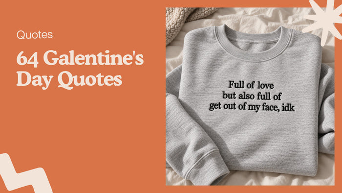
Our own sarcastic designs go the other way. Most of our lines are stitched in a plain serif, close to the formal look Connare thought was wrong for a cartoon. On a sweatshirt that says something rude, the straight-faced font is part of the joke. The Completely Deaf to Your Words embroidered sweatshirt is one example: a soft gray crewneck with three lines of black serif text.

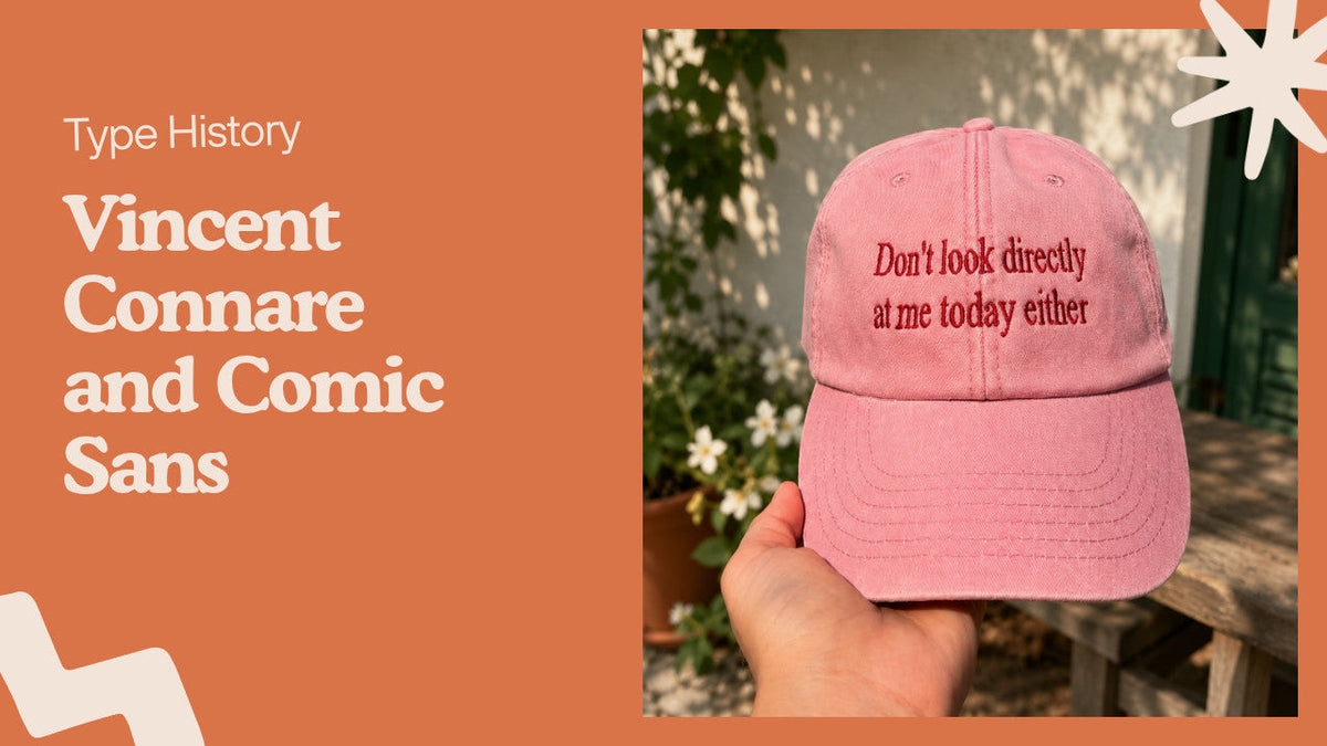
Every design we make is machine embroidered with a stabilizer layer behind the stitches so the fabric stays flat. New designs get a test run on scrap fabric first, which is where letter spacing problems show up. The same deadpan style is on the Don't Look Directly at Me embroidered washed cap.
Want a wider comparison of type on apparel? See 31 fonts for t shirts that read well in print and thread. For why we stitch instead of print, read our buyer's guide to printing methods.
Vincent Connare FAQ
Who created Comic Sans?
Vincent Connare, an American type designer at Microsoft, created Comic Sans in 1994. The letters are based on hand lettering in comic books.
Why did Vincent Connare make Comic Sans?
Times New Roman in the cartoon speech balloons of Microsoft Bob looked too formal to him. So he drew a casual font meant for that kind of on-screen dialogue.
What fonts did Vincent Connare design besides Comic Sans?
At Microsoft he worked on Trebuchet MS and Webdings and finalized the Marlett icon font. Later, at Dalton Maag, he designed Magpie.
Does Vincent Connare regret Comic Sans?
No. Connare has called it "the best joke I've ever told" and said he finds the hate for it mildly amusing.
Where does Vincent Connare work now?
After leaving Microsoft in 1999, Connare joined the London type studio Dalton Maag in 2001. Photography is also part of his work.
Is Comic Sans good for embroidery?
Its rounded, even strokes stitch cleanly at medium sizes on shirts and hats. Keep the text short and use a thread color that contrasts clearly with the fabric.
Looking for something with your own words on it? Browse our personalized embroidered gifts or the best-selling embroidered designs.