A curved rainbow title with a drop shadow can look great on a laptop screen and turn into a muddy smear on a sweatshirt. We see the gap between screen and fabric every week. Most lettering ideas reach us as a quick design made in Word, Canva or a shirt-design tool. Knowing which WordArt letters survive that trip saves a reprint, or in our case, a re-stitch.
WordArt letters are text turned into a graphic, with a fill, outline, shadow or curve you can resize like a picture. Microsoft Word, PowerPoint and Excel call the feature WordArt. Shirt-design sites use "word art" for ready-made letters, numbers and phrases. For printing or embroidery, keep the effect simple: a solid fill, one outline and letters at least about a quarter inch tall.
What WordArt letters are, and where people make them
This part is for anyone who has heard the term and wants to know which tool to open. Two different things share the name.
In Microsoft Office, WordArt is a text style you add from the Insert tab. It lives in a floating box, so you can tilt it, bend it along an arc or stretch it across a page. Teachers use it for classroom signs. Parents use it for birthday banners.
On custom apparel sites and in apps like Canva, "word art" usually means pre-built graphics. Think of a phrase in a decorative layout, varsity numbers, or single letters with a pattern fill. You pick one, change the color and place it. The upside is speed, but you rarely know whether the design was drawn with thread or ink in mind.
How to make WordArt letters in Microsoft Word
Use these steps if you want a mockup to show a printer, a teammate or us before you order. They match Word for Microsoft 365 on Windows; the Mac version uses the same menu names.
- Open a blank document and click the Insert tab.
- In the Text group, click WordArt and pick a style from the gallery. A box appears with placeholder text.
- Type your own letters, numbers or phrase over the placeholder.
- Select the text, then go to the Home tab to change the font and size. Pick the font first, because effects look different on every typeface.
- Open the Shape Format tab and use Text Fill and Text Outline to set colors. Choose a solid fill if the design is headed for fabric.
- For a curved or arched line, go to Text Effects, then Transform, and choose an arc. Drag the small orange handle to adjust the bend.
- Write down the font name, colors and approximate size next to the design. A shop can match those details exactly, while a screenshot only shows how they looked on your monitor.
WordArt letter styles that hold up on fabric
If you are planning a shirt, hat or tote, this is the section to read before you fall in love with an effect. Ink and thread each have limits, and most fancy WordArt presets ignore both.
Block and varsity letters
Thick, square letters are the safest choice for both printing and embroidery. They stay readable from across a room. Jerseys, school names and Greek letters use them for that reason.
Outlined letters
A single outline around a solid letter works well. Two or three stacked outlines, a common Office preset, get crowded once you shrink the design to fit a left-chest spot. On a hat front, one outline is plenty.

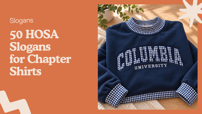
Pattern-filled block letters, like the gingham letters on our custom gingham Greek letters sweatshirt, are a fabric version of WordArt's texture fill. The pattern only reads because each letter is big and the stitched border is solid.
Script and handwritten letters
Thin connecting strokes vanish when they get small. Script that looks elegant at 2 inches tall can break apart at half an inch. Keep script phrases large, or switch to a print-style handwritten font. Bigger is safer.
Gradient and glow effects
Screen printers can reproduce some gradients with halftone dots. Embroidery cannot blend colors the same way, so a gradient becomes two or three flat color bands. Pick one color per letter and you avoid surprises.
Shadows and 3D bevels
A soft shadow is just a blur, and blurs do not exist in thread. A hard offset shadow, a second copy of the letter shifted a little, does translate. Bevels and reflections should go.
Curved and arched text
Arches look classic on sweatshirts and caps. The tighter the curve, the more the letters crowd at the inside edge. Give short words a gentle arc and leave long phrases straight.
For specific typefaces, see our guide to fonts that work for embroidery on hats and sweatshirts. Printed shirts are covered in the fonts that read well in print and thread post.
Word art numbers for jerseys, years and ages
Numbers are their own category because people read them from far away and in a hurry. Get them wrong and the whole shirt looks off. Weight matters most.
Team and jersey numbers
Players and fans want a number that a coach can spot across a field. Use a heavy block or athletic face, one outline, and no effects inside the digits. Our list of fonts for sports jerseys with name and number picks breaks it down by sport.
Years and class dates
"Est. 2019" or "Class of 2027" lines are usually small, so thin serif numerals lose their shape. A 1 and a 7 in some decorative fonts look almost identical. Type the year out and check it at the size it will be printed or stitched.
Ages and milestone birthdays
A big "40" or "70" is often the whole design, which means you can afford a bolder style here. Pattern fills, a contrasting outline or a stacked number and word combo all work when the digits take up most of the space.
Word art phrases that fit on a shirt or hat
Short phrases are what most people search word art for. These ideas are for gifts, group shirts and everyday caps, and each one is short enough to stay readable on a hat front.
- Family trips: "Lake Days," "Road Trip Crew," "Out of Office"
- Adoption and new family days: "Gotcha Day," "Chosen," "Our Family Grew"
- Reunions: "Same Family, New Shirts," "The Smith Reunion 2027"
- Bachelorette weekends: "Bride Squad," "Last Fling," "Maid of Honor"
- Sarcastic everyday caps: "Not Today," "Running on Spite," "Nap Advocate"
- Holidays: "Merry and Tired," "Spooky Season," "Thankful and Full"
- Coworkers: "Team Spreadsheet," "Reply All Survivor"
Two lines with three or four words each fit most cap fronts. A sweatshirt chest has room for a longer line, but people still read the first three words and stop. Shorter wins.

The Art of Doing Nothing washed cap is a good size reference. It fits five words on two lines, in hand-lettered white capitals.
Mistakes when moving word art from screen to fabric
Read this list before you send a design to any print or embroidery shop. Each item comes from how ink and thread behave, not from taste. All six are easy to fix.
- Thread color too close to the garment. Dark green letters on a navy sweatshirt disappear from two steps away.
- Letters smaller than about a quarter inch. Thread cannot form the inside of a lowercase e or a at that size.
- Too many effects at once. Outline, shadow, glow and gradient together turn into noise on cotton.
- Sending a screenshot instead of the text. A shop has to redraw a screenshot and guess the font.
- Skipping a spelling check on personalized pieces. A name with a typo is still a custom order, and most shops cannot resell it.
- Squeezing a long phrase onto a curved line. Inner letters touch and the phrase reads as a blur.
How we stitch lettering at Me Do Embroidery
This part is for anyone deciding between an embroidered design and a printed one. We only do embroidery, so here is how lettering gets from file to garment in our shop.
Every design is digitized first, which means someone turns the letters into stitch paths. Our post on what digitizing in embroidery means explains the steps. Each new design gets a test run on scrap fabric so we can adjust stitch density before it touches a real sweatshirt. A detailed design takes 4 to 9 minutes on the machine, and a stabilizer layer behind the fabric keeps the letters flat.

The Merry Christmas letter blocks sweatshirt shows a WordArt idea built for thread. Each letter sits in its own solid square, so the small lowercase font stays readable. For Greek letters on a bag, the Greek letters striped tote bag uses plain block letters on heavy canvas.
We use French DMC thread, which does not fade or bleed in the wash. Orders are made to order and arrive in 3 to 7 business days, production included.
Names and initials are in our personalized embroidered gifts collection. Personalized pieces cannot be returned, so check the spelling twice. If you want to stitch letters yourself, start with our guide on how to embroider letters by hand.
WordArt letters FAQ
Where is WordArt in Microsoft Word?
WordArt is on the Insert tab, in the Text group, shown as a slanted letter A. Click it, choose a style and type over the placeholder text.
Can WordArt letters be embroidered?
Yes, if the design uses solid fills, one outline at most and letters roughly a quarter inch tall or bigger. Gradients, glows and soft shadows do not translate to thread.
How do I curve WordArt text?
Select the WordArt, open Shape Format, then Text Effects, then Transform, and pick an arc. Drag the orange handle to make the curve tighter or looser.
What is the difference between WordArt and clipart?
WordArt is editable text with visual effects, so you can change every letter. Clipart is a ready-made picture, and word art clipart is a picture of a phrase that you can recolor but not retype.
What font works best for numbers on a shirt?
A heavy block or athletic font with one outline is easiest to read from a distance. Avoid thin decorative numerals for small dates, where a 1 and a 7 can look alike.
Should I send a screenshot of my WordArt to a print shop?
Send the exact text, the font name and the colors along with the screenshot. The shop can rebuild the design cleanly instead of tracing a blurry image.